 As a designer, we are inherently interested in venturing into new arenas of product development/design for any number of reasons. David Whetstone is doing his part to develop his portfolio by doing independent research and development for Taylor Made golf bags. His sketches are fun and playful while being informative. This kind of initiative is what employers look for in employees. If you are interested in entering an area of design in which you are not familiar with, I suggest you do what David has done. Don't let others dictate your future to you, build your portfolio around your talents/skills/interests and send it off to those who can give you feedback so that you may achieve your dreams of being a transportation designer/soft goods designer/or whatever. All you have to fear is failure, a trait product development professional are all to familiar with. Who knows, you may be able to bring a new perspective to an industry that is yearning for change.
Wednesday, June 17, 2009
Round Out Your Portfolio - Build Your Tool Box
As a designer, we are inherently interested in venturing into new arenas of product development/design for any number of reasons. David Whetstone is doing his part to develop his portfolio by doing independent research and development for Taylor Made golf bags. His sketches are fun and playful while being informative. This kind of initiative is what employers look for in employees. If you are interested in entering an area of design in which you are not familiar with, I suggest you do what David has done. Don't let others dictate your future to you, build your portfolio around your talents/skills/interests and send it off to those who can give you feedback so that you may achieve your dreams of being a transportation designer/soft goods designer/or whatever. All you have to fear is failure, a trait product development professional are all to familiar with. Who knows, you may be able to bring a new perspective to an industry that is yearning for change.Monday, June 15, 2009
Concept Exploration Using an Underlay - Gatorade Packaging
 What is an underlay? Why do designers use them? How can I use an underlay to develop solid solutions for my client? Christopher Lavelanet, an independent contract designer who travels between the US and the EU, has utilized underlays to easy overcome the spacial and volumetric hurdles designers sometimes face when developing design solutions. An underlay is a reference image used by designers to eliminate the need to redefine overall proportion each time they begin to develop a new concept. In the example shown above, the underlay is a simple line drawing, probably taken from a 3D cad drawing, the defines the volumetric considerations the designer needs to stay within as he develops his solutions. He then places another piece of paper, perhaps vellum, tracing paper, graphics 360, etc. on top of the line drawing and uses it as a reference for his design explorations. Underlays also serve to eliminate the need for the designer to redefine the perspective, scale, and proportions that are more easily tackled by using an underlay. This is only a tool used by designers to speed up their process.
 Once the sketches and simple shading are completed the designer can then take the newly defined concept and add some color so that they are more easily read by those that aren't as visually enabled as the designer.
Thursday, May 7, 2009
Ahh! Ideation sketches and Design Process. Just what we like to see!
As a designer I truly enjoy seeing the sketches that are the physical representation of ones thoughts. They represent the breadth of considerations that the designer is cognizant of while researching, designing, engineering, and prototyping solutions. Those that are not designers are usually blown away by the range of ideas that are considered when developing a product or solution. Zach Hastings has served up another great project for us to learn from. As I look over the process boards available in his digital portfolio I am presented with a well considered process that conveys what lengths a designer must go to in order to deliver a mindful product or solution. This project was undertaken by Zach while in College at The Massachusetts College of Art and Design in Boston Massachusetts. The project, as it reads, was presented as a branding exercise. Where Zach was to develop the branding for a hand held vacuum for the cordless power tool market. The brand that was selected was DeWalt.
 A term that is used to describe brand identity in terms of its physical manifestation, is its Form Language. The form language of a brand, as it pertains to Brand Identity, are the physical embodiments that a family of products has established across all of its product offerings. Color, something a majority of consumers use to initially identify one brand or product offering from another, is very often used by a company to establish the initial visual relationship a consumer has with their product. I could delve into Color Psychology and how color can have a very strong affect on a consumers decision making process, but I will leave that for another article. Though I did want to make you aware that color is a strongly held consideration of Brand Identity.
 Case-in-point is the DeWalt Brand. The color combination of yellow/black is a very strong identifier for their brand, which they have Trademarked. Those that have seen the array of brands that are available within the power tool segment would not confuse Makita and DeWalt. Color is not the only Brand identifier. As I said the physical attributes are key to properly presenting the form language of a brand. And the logo isn't what I mean by physical embodiment. The physical attributes or characteristics of a product seek to inform you, the consumer, what features and benefits one solution offers over other options. Which are more often than not sitting right next to each other on the shelf. To keep with this specific example Zach has put together a set of detail images that illustrate exactly what I mean. He has tagged them Brand Identity and shows detailed images of how form language used in his design solution echos those of DeWalts existing products.
 In terms of research, Zach delved into both the DeWalt Brand and the hand held vacuum segment. Some of the questions he asked were. Who was already in the segment? What do those solutions do well? What do they do poorly? Price points and capabilities? Are they comfortable to hold and use? Do they cause undue stress or strain? What components are housed within the device? All of these factors, and many more, play a part in the development of a product. In an effort to truly understand the product he was developing Zach purchased a hand held vacuum and took it apart in order to understand what components he had to work with and how they might resolve some of the design consideration for him. Designers need to be aware of nearly every aspect of the product development cycle. The five W's (Who, What, When, Where, Why, and How) and everything else that comes along with those questions.
 The final solution is the physical representation of all of the research, testing, engineering, and other discoveries that occur during the product development process. In the final model shown above, Zach has used the tools and materials available to him in order to accurately present his design concept in the most faithful way possible. A prototype is neither an example of how the item will be manufactured nor an example of the specific materials that the actual product will be manufactured with. The final solution is a consideration of the needs of the market. The cost of the item as it relates to production and the value the consumer places upon it, amongst other considerations. If the market place is already saturated by hand held vacuums for the cordless power tool segment. Then the target consumer is less likely to make a purchase, which renders the entire exercise an adventure in R&D and not a profitable one that most companies are likely to endeavor upon.
This project was undertaken by Zach while in College at The Massachusetts College of Art and Design in Boston Massachusetts. The project, as it reads, was presented as a branding exercise. Where Zach was to develop the branding for a hand held vacuum for the cordless power tool market. The brand that was selected was DeWalt.A term that is used to describe brand identity in terms of its physical manifestation, is its Form Language. The form language of a brand, as it pertains to Brand Identity, are the physical embodiments that a family of products has established across all of its product offerings. Color, something a majority of consumers use to initially identify one brand or product offering from another, is very often used by a company to establish the initial visual relationship a consumer has with their product. I could delve into Color Psychology and how color can have a very strong affect on a consumers decision making process, but I will leave that for another article. Though I did want to make you aware that color is a strongly held consideration of Brand Identity.Case-in-point is the DeWalt Brand. The color combination of yellow/black is a very strong identifier for their brand, which they have Trademarked. Those that have seen the array of brands that are available within the power tool segment would not confuse Makita and DeWalt. Color is not the only Brand identifier. As I said the physical attributes are key to properly presenting the form language of a brand. And the logo isn't what I mean by physical embodiment. The physical attributes or characteristics of a product seek to inform you, the consumer, what features and benefits one solution offers over other options. Which are more often than not sitting right next to each other on the shelf. To keep with this specific example Zach has put together a set of detail images that illustrate exactly what I mean. He has tagged them Brand Identity and shows detailed images of how form language used in his design solution echos those of DeWalts existing products.In terms of research, Zach delved into both the DeWalt Brand and the hand held vacuum segment. Some of the questions he asked were. Who was already in the segment? What do those solutions do well? What do they do poorly? Price points and capabilities? Are they comfortable to hold and use? Do they cause undue stress or strain? What components are housed within the device? All of these factors, and many more, play a part in the development of a product. In an effort to truly understand the product he was developing Zach purchased a hand held vacuum and took it apart in order to understand what components he had to work with and how they might resolve some of the design consideration for him. Designers need to be aware of nearly every aspect of the product development cycle. The five W's (Who, What, When, Where, Why, and How) and everything else that comes along with those questions.The final solution is the physical representation of all of the research, testing, engineering, and other discoveries that occur during the product development process. In the final model shown above, Zach has used the tools and materials available to him in order to accurately present his design concept in the most faithful way possible. A prototype is neither an example of how the item will be manufactured nor an example of the specific materials that the actual product will be manufactured with. The final solution is a consideration of the needs of the market. The cost of the item as it relates to production and the value the consumer places upon it, amongst other considerations. If the market place is already saturated by hand held vacuums for the cordless power tool segment. Then the target consumer is less likely to make a purchase, which renders the entire exercise an adventure in R&D and not a profitable one that most companies are likely to endeavor upon.Wednesday, April 29, 2009
Which Prototyping Method Should I Use & What's The Difference?
I received an email today from Protomold which highlighted a number of options available to product developers. While this is not a complete list it is an excellent beginning and Protomold is a great resource for you to both learn from and develop a business relationship with. I am going to copy and past the information they provided to me via email. My hope is that you find this article informative and are able to leave knowing that you have learned something new about prototyping and product development on Design Exposed.
The word “prototype” comes from the Greek, protos meaning “first” and typos meaning “impression.” Like many words, its meaning has changed over time, so that a single finished product can be preceded by a number of “first impressions.” And while we’re often told the importance of making a great first impression, not all prototypes need to be great; some need only be adequate for a specific task. (Of course before committing to production, you might want at least one great first impression.)
Prototype plastic parts serve a variety of purposes. They can be used to test:
Form: Appearance, including overall shape, surface texture, and color.
Fit: The ability to interconnect with other parts of an assembly.
Function: The ability to withstand various kinds of stress under varying conditions, such as mechanical fatigue, heat, radiation or chemicals.
Manufacturability: The ability to be made using standard high volume production methods such as machining or injection molding.
Viability: The ability to appeal to the market. This means getting a production equivalent part into the hands of the consumer for testing. Because product development is an iterative process, it can include multiple prototyping steps, each serving a different function.
Virtual prototyping is supported by advanced 3D CAD software and actually produces a simulation of the part being designed. It is ideal for early conceptualization.
Pros: It allows parts to be designed, revised, virtually fitted together, and tested under simulated stress using finite element analysis. It lets a designer create and revise a design in real time at no cost except that of the software.
Cons: It is entirely digital, so going directly to high volume production from this point is very risky.
2. Stereolithography Apparatus (SLA)
SLA is an additive process that uses a computer controlled laser to cure layers of photopolymer resin. The process is suitable for making concept models or prototypes to support presentations or trade shows.
Pros: The process is a relatively inexpensive and fast way to make a single part, produces a good surface finish, and can reproduce very complex (even unmanufacturable) geometries. It is a good choice for testing the form and fit of a part.
Cons: It only works with a very limited range of proprietary resins and produces a fragile end product whose dimensional stability suffers over time.
3. Selective Laser Sintering (SLS)
SLS uses a computer-controlled laser to fuse powdered material. As is the case with SLA, SLS is suitable for making initial prototypes for demonstration purposes.
Pros: The process is relatively quick and inexpensive, produces more durable parts than SLA, and can also reproduce very complex geometries. It is a good choice to test form, fit and, to some extent, function.
Cons: It works with a very a limited range of materials, and the resulting parts have a rough finish. Although the parts tend to be more durable than those made using SLA, they are weaker than injection molded or machined parts. For these reasons it is not a good choice to test manufacturability or viability.
4. Fused Deposition Modeling (FDM)
FDM uses a thermal print head to deposit and fuse layers of resin. The process can produce both demonstration parts as well as low volume production parts for some applications.
Pros: It is a relatively inexpensive way to make prototype parts that are stronger than either SLA or SLS, and can also produce very complex geometries. It can be a good choice for testing form, fit and sometimes function. The material properties are better than SLA or SLS.
Cons: The process is much slower than the other additive processes and suffers from the same stair-stepped surface finishes (although this can be addressed to some extent with post-processing). It also only works with a small number of proprietary materials and cannot produce parts with the standard mechanical properties of CNC machined or injection molded parts. It is usually not a good choice for testing, manufacturability or viability.
5. Three Dimensional Printing (3DP)
3DP uses a print head to lay down a plaster-like material. As is the case with SLA, it is well suited for producing conceptual models during the early stages of design.
Pros: This is the fastest and least expensive of the additive processes. It allows the production of colored models and is ideal for testing form.
Cons: Parts have a rough surface finish and are very fragile. The material choices are even more limited than with other additive processes, and for these reasons it is not a good choice for testing fit, function, manufacturability or viability.
PJET is similar to SLA, using computer controlled UV light to cure layers of photopolymer. As is the case with SLA, PJET is used primarily as a concept modeling process.
Pros: The process offers the same advantages of SLA, but the process is less expensive to operate and is more office-friendly.
Cons: It has the same disadvantages as SLA, and is much more limited in the size of parts that can be made.
CNC machining uses standard computer controlled equipment to cut parts from a solid block of material. With the advent of First Cut’s automated toolpath generation technology, the process is useful for demonstration parts through low volume production.
Pros: It is as fast as the additive processes, and because it uses standard materials as feedstock it produces parts comparable to injection molding. For these reasons the process is a good choice for testing form, fit, function and viability.
Cons: The process is generally not well suited for production quantities in excess of hundreds of parts (see rapid injection molding).
8. Rapid Injection Molding (RIM)
RIM involves the use of proprietary software to automate the process of quoting, designing and manufacturing injection molds. It is useful in the production of small to medium quantities of parts for testing or bridge tooling prior to production.
Pros: RIM produces real injection molded parts in as little as one business day at a fraction of the cost of conventional injection molding. The parts are ideal for testing function, manufacturability and viability.
Cons: The non-recurring cost to manufacture the mold can make this process more expensive than additive prototyping processes for low volumes.
For a free, detailed report on prototyping processes, including detailed information on material strengths, surface finishes and process selection, visit their web site.
Monday, April 27, 2009
Inspirational Image Of The Day - Daniel Schumpert
 Daniel Schumpert is a digital artist whose images have inspired me to get a Wacom tablet and dive into digital painting. I have to admit that when I look at this image all I see is Ayrton Senna and the days I would spend watching and learning about F1 from my brother. Daniel's image is an excellent exploration into the possibilities of digital art in the future.
Concept Development & Exploration
It is important to keep in mind that during the development/exploration process you are exploring the many possible solutions for a problem. Not preparing a final rendering for a client presentation. You should explore your thoughts in a way that allows you to get the most out of your time. You can always go back and further explore a thumbnail sketch you have on your exploration page. Its about quantity, quality, and letting your ideas flow onto the paper and develop into thoughtful solutions. Some designers say this is where the the idea really develops. That being said, time is always a factor and you should manage your time so you get the most out of it.
The exploration pages by Marcos Madia, Michael Roller, and Colin Jackson all illustrate the varying ways in which designers explore solutions. Some use a more traditional medium, such as pen paper, and markers, to explore and refine their thoughts. While others use a digital medium to both explore and refine the forms they are developing. All are fine examples of concept exploration and you should use the method you prefer. Most importantly you should not let the tool get in the way of your process. If you are new to the digital medium, perhaps you should stick with the tried and true method you are familiar with until you feel more comfortable.
 At the end of the day concept exploration is about ideas, not about presentation. Although you want to ensure that the design intent is maintained so you should make the effort to deliver clear sketches that fully convey your thoughts. Elements such as arrows and call outs help in this endeavor.
While others use a digital medium to both explore and refine the forms they are developing. All are fine examples of concept exploration and you should use the method you prefer. Most importantly you should not let the tool get in the way of your process. If you are new to the digital medium, perhaps you should stick with the tried and true method you are familiar with until you feel more comfortable.At the end of the day concept exploration is about ideas, not about presentation. Although you want to ensure that the design intent is maintained so you should make the effort to deliver clear sketches that fully convey your thoughts. Elements such as arrows and call outs help in this endeavor.
Saturday, April 25, 2009
Hyper-Realistic Rendering
 Russ Schwenkler of Dangeruss is a world class digital modeler and 2d graphic artist, referred to as a Vexel artist. If you want to know what the definition of Vexel art is then head over to his site and read his about section.
I came across Russ's work and was blown away by his attention to detail, proportion, and visually acuity. Russ offers clients a wide variety of graphic services. He can assist you in bringing your concepts to life through 2d imagery, 3D modeling, hyper-realistic rendering and presentation images. Russ also offers CAD accurate modeling and illustration of your technical or manufacturing project. He can supply illustrated parts breakdowns, component location drawings, manufacturing drawings and CAD solid models. I am presenting Russ's work because he is the bar to beat. His work is what designers should strive for when developing visually accurate renditions of their concepts. To present a solution on paper and then alter that because 3D isn't your strong suit compromises the design integrity of your work. The long hours are worth it and your dedication will not go unnoticed.
Nike FeelFree - Headset for Relaxation. Identification, Ideation, and Solution.
 Hannes Seeberg of Provoke Design in Tallinn, Estonia doesn't begin the design process with the design aesthetic and functional requirements all worked out in his mind. He allows the process of discovery to determine the needs that he must meet in the final solution. It didn't begin with perfect sketches or all of the necessary research laid out on a breadcrumb laden path either.
 Hannes began by identifying a problem that affects 15% of the worlds population, which is depression. And 80% of these 15% are not undertaking any medical or psychological assistance. According to Hannes research, depression will be the second largest killer after Heart Disease by 2020.
 Aside from the statistics and percentages he then began to research how the mental health of those affected by depression are currently being treated and how he may be able to present a new method of treatment utilizing sound. In the interest of moving forward and allowing the research Hannes conducted to speak for itself. I will move on to presenting Hannes ideation process and look at his sketches so that we are able to discover how Hannes thinks on paper.
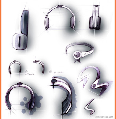 In this initial set of sketches you can clearly see into Hannes thought process. His preliminary sketches present us with a form language for the speaker area of the headphones that is similar to what we are already familiar with seeing. Hannes is aware that he isn't developing a solution for listening to traditional music as we know it. And thus his solution shouldn't look like what we are traditionally accustomed to seeing.
He is developing a solution "that uses advanced technology to read brain frequencies and change it toward the applied stimulus without having a side affect on the users hearing." As this sketch page develops, Hannes is moving away from what tradition has taught him. He is now beginning to explore alternative methods of sound delivery. This is most clearly illustrated in the last sketch on the page above, which in profile presents itself as an S shape. (lower right)
In this initial set of sketches you can clearly see into Hannes thought process. His preliminary sketches present us with a form language for the speaker area of the headphones that is similar to what we are already familiar with seeing. Hannes is aware that he isn't developing a solution for listening to traditional music as we know it. And thus his solution shouldn't look like what we are traditionally accustomed to seeing.
He is developing a solution "that uses advanced technology to read brain frequencies and change it toward the applied stimulus without having a side affect on the users hearing." As this sketch page develops, Hannes is moving away from what tradition has taught him. He is now beginning to explore alternative methods of sound delivery. This is most clearly illustrated in the last sketch on the page above, which in profile presents itself as an S shape. (lower right)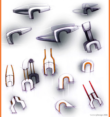 Now that Hannes has broken from tradition and is developing a concept that considers how sound is presented to the user. He is tasked with developing a pair of headphones that align with the aesthetic, functional, and performance minded values that the Nike brand encompasses. And in order to do this accurately, he must research the Nike brand and discover the underlying styling ques that tie all of their products together within the product segment he is targeting.
 As we see his, around the ear, concept develop we begin to see the lines of his sketches take on a more precise and intentional path. The curvilinear shapes begin to develop and take on a personality of their own and and breakaway form the rectilinear forms he was developing earlier. As he proceeds to develop the personality of his concept we see a more evident direction come into focus. A solution that is symmetrically balanced and uses a curvilinear silhouette to garner the attention of the user. Indicating that these aren't headphones solely designed for reproducing the whales of your favorite artist!
Hannes has taken a step back and developed a solution that projects the sound toward the users ears similar to how it would in a more natural environment. The form he has created is a new aesthetic vision for how sound is presented to the listener.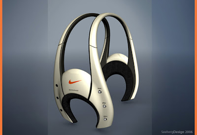 He has accomplished this while also accurately conveying the excitement, personality, and dependability of the Nike brand.
He has accomplished this while also accurately conveying the excitement, personality, and dependability of the Nike brand.
Thursday, April 23, 2009
Why and How to convey moving parts in a sketch.
 Adding arrows is an excellent technique that designers use to illustrate the functionality of a design. Andres has done a fine job of presenting the functionality of this sketch table by keeping the lines of the table clean. Allowing the viewer to focus on both the design of the table and on its functionality. He has used arrows to convey that the drawing surface rotates, the drawers flip out, and that the desk can adjust in width to suit the user. Lightly coloring the arrows conveys that the designer considered both the design and functionality of the concept. Andres also grounded the sketch by using a block of color behind the sketch, which adds depth and visual weight to the composition. This technique also adds another layer of consideration that clients enjoy seeing.
Shoe Concept - Adidas
Keeping with today's theme of visually inspiring sketches and texturally rich rendering. We are set to review Nicolas Bodin's concept sketch based around the Adidas brand.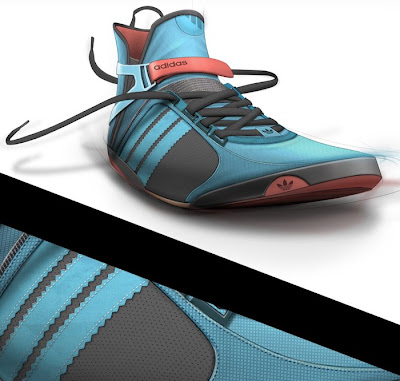 Nicolas has gone to great lengths to consider the composition of this sketch. The very expressive and lively posture of the shoe and the laces really express the personality of the shoe and the person who would wear it. The Velcro strap and finger loop on the back of the shoe really convey how simply it will be to slip these shoes on. Another very evident aspect of the design of these shoes and the way they are presented is that these shoes don't take themselves to seriously and are socially disarming in today's generation. Like Andres, Nicolas has considered the assembly of the shoe and how he can use the stitches as part of the design. In the lower half of the image you can see a glimpse of the details he considered when designing this shoe. The texture really adds another layer of complexity and refinement to the design. Something that can easily be overdone and should be carefully weighed before laying down your final thoughts.
Nicolas has gone to great lengths to consider the composition of this sketch. The very expressive and lively posture of the shoe and the laces really express the personality of the shoe and the person who would wear it. The Velcro strap and finger loop on the back of the shoe really convey how simply it will be to slip these shoes on. Another very evident aspect of the design of these shoes and the way they are presented is that these shoes don't take themselves to seriously and are socially disarming in today's generation. Like Andres, Nicolas has considered the assembly of the shoe and how he can use the stitches as part of the design. In the lower half of the image you can see a glimpse of the details he considered when designing this shoe. The texture really adds another layer of complexity and refinement to the design. Something that can easily be overdone and should be carefully weighed before laying down your final thoughts.Inspirational Image Of The Day - Andres Parada
 Andres Parada's digital rendering is a great way to start the day. Andres over the shoulder bag concept for Echo Unltd. began as a pen sketch on paper. He then took it into Photoshop and rendered a concept that became more than a concept, he illustrated a bag that has its own personality.
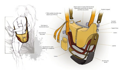
From a materials standpoint the design is comprised of denim, leather, a cotton weave, and brushed aluminum for fasteners. Andres has done an excellent job of portraying different materials using color, value, and texture. The details Andres has illustrated are very important to the success of the design. The stitching and fastening points, as well as the double shoulder strap all speak to the type of designer Andres is. The detail presented in his sketches, material choices, and added lifestyle image all work to define how well Andres understands the process of creating an over the shoulder bag. He hasn't left the details to the seamstress or someone else to define. His ability to present a detailed and understood concept disarms the client and allows them to gauge the aesthetic value of the design and not whether he understands cut and sew techniques.
Wednesday, April 22, 2009
Sea-Doo GTI
 Joe Ellice of Sheboygan Wisconsin is keeping the green theme going with his design for the Sea-Doo GTI. Joe indicates that the Sea-Doo GTI is meant for family fun. Joe communicates this persona with the design form language. The soft gentle forms, playful graphics, and inspirations derived from wildlife (star fish & sea rays) found its way into the design language of the GTI. A great amount of emphasis was placed upon comfort and ergonomics. This is specifically noted in the organic features of the seat and rear handle.
 The images you see here are only a small cross section of the images Joe gathered for inspiration. He researched and assembled the images above to create an inspirational image board that would provide him with the visual representations of the physical form language he aspired to develop for the GTI. This element of the creative process isn't as easy as just surfing the net for random images and grouping them together. The purpose of an image board is to provide yourself with targeted images that you draw inspiration from throughout the creative process. Another reason you may do this is to ensure that you develop a unique and consistent form language.
 The inspirational image board Joe assembled has apparently not led him astray. By reviewing each of the black & white photographs and comparing it to the associated image to its right. You should be able to see a parallel relationship between the images Joe assembled and the photographs of the clay model. The photographs of the clay model are shown in black & white so you can focus on the forms Joe has developed and not be sidetracked by any background color or discoloration that may have been captured in the photographs.
Tuesday, April 21, 2009
Nike Ideation - Rafa Nadal
 Some sketches have enough life to inspire you throughout the day! Luke McConnie's sketch ideation board for Rafa Nadal's signature Nike shoe certainly has legs. This is another great technique you can use to present your thought process to other designers. Flesh out the features you are interested in conveying and leave the rest of the image as an un-rendered sketch. This subtle technique draws your attention to the more detailed elements of your design and allows you to establish that the features being presented are designed to create an emotional response from the consumer. Each feature will resonate with different segments of the target users.
 The montage you see here is called a mood board. A mood board serves as inspiration to the designer. Things such as texture, scale, proportion, emotional visualization ques, a feel or identity related to the product, or just something that represents the mood you want to be in when you develop your concepts. Luke indicates that one of the images on this mood board inspired a pattern he designed for the outsole on one of the designs.
SleekStor Collapsible Measuring Cups
 Joshua Stewart developed these silicone measuring cups while working at Chef'n Corporation. They easily collapse to reduce their size which allows for easier more convenient storage. The silicone is capable of withstanding temperatures in excess of 650°F. They received an I.D. Magazine Annual Design Review honorable mention in 2006. For more information or to see the available colors.
Personal Grooming - Curling Iron
 Zach Hastings set out to research the habits of personal grooming. After a week of looking and listening he discovered that a device used by millions of women everyday was in serious need of an overhaul. Zach didn't begin and end his research process with observation. He took it a step further and studied how the device is used, he read consumer report articles, customer reviews on Amazon, and also looked into injuries related to the use of this device. Zach was the customer’s greatest advocate and because it was within his ability to develop lasting changes, he did his best to leave no stone unturned. Zach's next step was to story board the functionality issues that are inherent in the device to ensure that he stayed the course during the design process. Storage, ergonomics, and safety are amongst the issues Zach discovered during his research.
 Beginning with safety, Zach discovered that most heating irons had a small rounded tip which left little consideration for the users fingers possibly leading to light or severe burns. Another element related to safety, for both the person who is using the device and the home and building they are in, was the stand. The stand, more often than not, is a thin piece of bent metal that mounts to the base of the heating element. Thereby absorbing the heat form the iron and possibly leading to accidental fires or burns. The mounting location for the stand is also traditionally used as the rotation point for the tong that clasps the hair. As a result the rotation point is also a tangling point for hair. Another overlooked element of the device is the power cord. Zach's research uncovered that the power cord was commonly wrapped around the device itself or tangled around other items when stored in drawers or in cabinets. The last feature we will discuss is the dial for controlling the intensity of heat the iron creates. Zach discovered during user interviews that no tactile or audible feedback was evident which would indicate if the temperature had been changed.
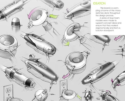
Zach then made a series of foam study models to support his concept ideas and to ensure that they worked ergonomically and from a functionality standpoint. This crucial step is vital to ensuring that his drawings hadn’t led him astray. This will also allow him to gain confidence in his functional design solutions. As his client will certainly to ask him questions relating to the functional characteristics of his design decisions. Zach’s design solutions include the addition of a base station. The base’s primary function is for storing the power cord there by reducing visual clutter and making use safer and more enjoyable. The curling iron which in the past has been relegated to live under the cabinet or in a drawer can now be proudly displayed on the bathroom counter for easy use. Or if they prefer to keep the device out of sight they can connect the iron to the base and place them in a drawer where they are no longer tying up the other items. The end cap has a radial taper which allows for easy nesting into the base and conveys a safe touch point. The hinge point for the tong lever has shifted to an inbound element. This subtle change greatly reduces if not eliminates tangles and burns. The barrel is now ceramic coated which reduces tacking and discoloration. The controls have been simplified into buttons that can provide audible feedback to indicate a change in temperature has been made.
 Overall Zach has developed a feature rich solution that has not complicated the process users are accustomed to, he has enhanced it. By reducing the stresses related to using a curling iron Zach has allowed the user to focus how their hair looks and not worry as much about accidentally burning their skin and in turn damaging their hair. Not to mention making life easier on us guys when we are sorting through the tangled web that is our bathroom drawer!
 Zach’s design solutions include the addition of a base station. The base’s primary function is for storing the power cord there by reducing visual clutter and making use safer and more enjoyable. The curling iron which in the past has been relegated to live under the cabinet or in a drawer can now be proudly displayed on the bathroom counter for easy use. Or if they prefer to keep the device out of sight they can connect the iron to the base and place them in a drawer where they are no longer tying up the other items. The end cap has a radial taper which allows for easy nesting into the base and conveys a safe touch point. The hinge point for the tong lever has shifted to an inbound element. This subtle change greatly reduces if not eliminates tangles and burns. The barrel is now ceramic coated which reduces tacking and discoloration. The controls have been simplified into buttons that can provide audible feedback to indicate a change in temperature has been made.Overall Zach has developed a feature rich solution that has not complicated the process users are accustomed to, he has enhanced it. By reducing the stresses related to using a curling iron Zach has allowed the user to focus how their hair looks and not worry as much about accidentally burning their skin and in turn damaging their hair. Not to mention making life easier on us guys when we are sorting through the tangled web that is our bathroom drawer!
Monday, April 20, 2009
K2 Snowboard boots
 Remi Marchand has captured a transitional image that presents his functional Snowboard boot concept as both a sketch/digial rendering and as a 3D rendering. When a concept is presented in this fashion the creative director and/or client can see how the designers idea took shape. The consistency in form and proportion when the 3D model is shown in contrast with the sketch conveys the designers grasp on viable solutions and how his other unrendered sketches will accurately translate into 3D models. Not to mention it is cool to see how accuratly he is able to depict his concept in both sketch and 3D form. This work was developed while Remi was at One & Co in San Francisco, Ca. Thanks to Remi for a great example of how designers bring new life to client presentations.
EV-0 RR TTXGP zero carbon fuel Grand Prix
Mark Wells, Co-Founder of Xenophya Design began his career at Northumbria University. He has taken his passion for motorcycles and transformed his dream into a reality. The images you are drooling over were designed by Mark for the TTXGP. The aim of the TTXGP is to promote clean emission technologies. Mark and his partner in crime Ian Wride have delivered one hell of a knock out blow to the belief that being green means you are gonna be slow. What did you think when you first saw Marks' sketches? I imagine you were blown away by the details and clean lines he delivers in his sketches. It almost looks like he used a tool to draw every line as they appear to be created with the assistance of some device. But this is not the case. Marks ability to draw clean and fluid concepts didn't just happen overnight. He continues to hone his skills as a designer, engineer, and researcher. This is not to be forgotten if you want to be able to draw what you see in your mind as fluidly as Mark draws what he sees in his.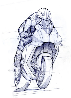 Let's break down the clean and direct pen sketch you see above. Initially you may notice the perspective lines flowing from left to right through the hub of the wheels. Mark has used them to keep the drawing in proportion and in the correct perspective. He then laid down light gestural lines to work through the proportions of the idea he had in his mind. Notice that these light gestural lines are done very quickly and are no longer as noticeable as they were in the initial minutes of his sketch. Once he defined the scale and overall position of the components of this sketch he began to digg into the heart of his thoughts about the form of the faring and overall attitude of the rider.
 Mark has presented a sketch that has real emotion behind it. It immediately tells you about the mind set of the rider. How his crouched position makes him more aerodynamic and that speed is his primary concern. To look at this sketch I am immediately pulled into the moment. I feel the acceleration of the bike and my bodies challenge against gravity as I fight to hold on to the handlebars. Excellent sketches like this will bring you into the sketch and force the will of the designer upon you. His truly emotional style is one to be referenced, but not copied. Mark has worked hard to develop his own sketching style. And so will you as you practice drawing the things you see in both the physical world and your cerebral world.
Let's break down the clean and direct pen sketch you see above. Initially you may notice the perspective lines flowing from left to right through the hub of the wheels. Mark has used them to keep the drawing in proportion and in the correct perspective. He then laid down light gestural lines to work through the proportions of the idea he had in his mind. Notice that these light gestural lines are done very quickly and are no longer as noticeable as they were in the initial minutes of his sketch. Once he defined the scale and overall position of the components of this sketch he began to digg into the heart of his thoughts about the form of the faring and overall attitude of the rider.Mark has presented a sketch that has real emotion behind it. It immediately tells you about the mind set of the rider. How his crouched position makes him more aerodynamic and that speed is his primary concern. To look at this sketch I am immediately pulled into the moment. I feel the acceleration of the bike and my bodies challenge against gravity as I fight to hold on to the handlebars. Excellent sketches like this will bring you into the sketch and force the will of the designer upon you. His truly emotional style is one to be referenced, but not copied. Mark has worked hard to develop his own sketching style. And so will you as you practice drawing the things you see in both the physical world and your cerebral world.Nintendo Wii Peripherals - Nerf Weapons
Nerf has always been a source of smiles and laughter for me. I don't ever recall not laughing about using one of their products, well then again... Never mind. Weston Boege has brought us something that gives us cause to call in sick! Weston was given the opportunity to develop a line of Wii game controllers while at Hasbro Toy Corporation based around Nerf's Brand Identity and Attitude Branding. His efforts have given me inspiration to grab my pen and a few pieces of paper. I love to see sketches like this and I am sure you will agree, they are awesome to look at. Weston loves his job and we can all tell by looking at his work.
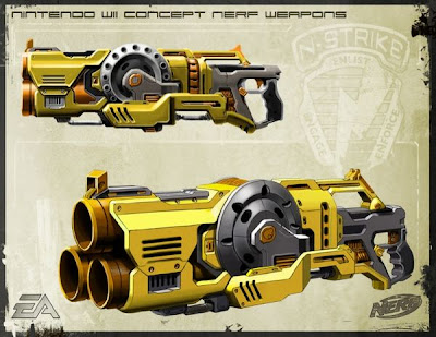 To break down his presentation renderings - Weston has presented two views on each of his presentation boards. One is a front 3/4 view and the other is an orthographic projection. Weston began with pen sketches, then scanned them into Photoshop and rendered them. The simplicity and straight forwardness of his drawings allows us to easily imagine ourselves using these toys. They are clearly illustrating the functionality of the product and the excitement that can be had when using one of his fantastic creations. If you look closely you can see some of the layout lines Weston used to define the proportions of his initial sketches. Layout lines allow the concept sketch to take on a life of its own and thus present the idea as a concept, allowing the brand managers or other decision makers to make changes without feeling as though the design is set in stone and unchangeable.
 The emotional response people have to your designs is very important. If at all possible we make every effort for it to be a positive one. We should have had these types of peripherals back in the days of Duck Hunt and Super Mario! Although my mother probably wouldn't have gotten one for me, I would have tried to convince her until I was sent to my room!
Sunday, April 19, 2009
How do you think on paper?
 The Design Process isn't a magical facet of design. It isn't tightly held by a group of top tier designers that don't want their secrets to get out. And there isn't some trick to it... Other than listening to your consumers and being aware of the environment in which the product may be used and then developing a solution that allows the consumer to get the job done. Kate Hickey has given us a glimpse into her design process that we won't let get away. Kate has taken her experiences using similar products, her insights gained from ethnographic research, and combined them(along with great skill) to design what may be the next advances for optical lasers, compressor feet, and compressor engine covers for DeWALT. If you want to see how a great designer thinks on paper, look no further than Kate Hickey. Sketches are developed by hand then taken into Photoshop for digital detail enhancement.
Concept renderings and sketches for Nike and Adidas
 This is where Cheng Kue begins his thought process. With Autodesk Sketchbook Pro he can sketch and color his shoe concepts in a rapid fashion. Allowing his designs to jump off the page and into production.
 Here is an example of the lengths an Industrial Designer goes to ensure that color variations are not only considered but thoroughly conveyed so each retailer has their own unique colorway. Cheng Kue says that once a solid direction is selected for concept he then begins a process of illustrating the concepts in Illustrator and then brings them into Photoshop to add texture and color. Each color variation was completed in 40 - 50 minutes.
Bringing personality to functionality
 Gone are the days when the simple paper clip is used as a purely functional item. Paul Sandip has brought us a new twist on the traditional paper clip and delivered personality and functionality.
Is that you Easter Bunny?
 While I won't normally be featuring illustration work on this site. From time to time I come across someones work that is so unique that I can't pass up the opportunity to share it with you. Vince Chui has put a new perspective on the furry bunny. This image is also part of an animated short featured on YouTube. Click the image to see what that dastardly bunny is hiding.
Philips Steam Iron
 Russell Blanchard brings us yet another intriguing set of concept sketches that makes design worth talking about. Russell began with pencil and paper then scanned his sketches into Photoshop to render them. Thus giving the sketches a life of their own and allowing others to visualize what he saw in his mind. More often than not consumer products are presented in varying colors which allow the product design managers to more effectively present the color options. As opposed to asking the marketing or sales team to "imagine" them in different hues.
SuperSki - Concept may inspire the next generation of Snow Mobiles.
 Colin Jackson of Helix Design brings out the racer in all of us! His game changing design could lead to a reversal in the current path of snow mobile design and riding style. If you have seen snow mobiles race on ice then you are aware of how insane this sport can be. And this fledgling concept might just be the welcome addition the sport has been waiting for.
How your shoes make the grade!
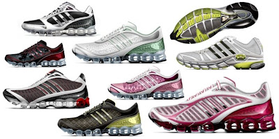
 Erik Arlen has a way of presenting designs that makes many within the design world envious. His gestural sketching technique leads to digital renderings that inspire many of us to add flair to our own presentations.
Saturday, April 18, 2009
1000 Acres Vodka Packaging by Arnell
 Via Daily Icon, new work from Arnell, the same folks who brought you the new Pepsi and the new (now discontinued) Tropicana packaging: "Elegant packaging for 1000 Acres premium Vodka. Glass vessels designed for display beyond the liquor cabinet."
Dentek - Value through Design
 DenTek, a consumer dental accessories business, worked with Philips Design Consulting for consumer insights and to better define its product experience, voice, image and ultimately, its brand. Russell Blanchard organized and led a design team that brought innovation and value through design to a range of emergency dental products. Solutions were developed from concept to prototyping and consumer testing to a successful launch into the market in 2007.
Subscribe to:
Posts (Atom)